Marcin
Manager zespołu, doskonały konferansjer! Góral z krwi i kości, dzięki czemu każde wesele jest niezwykle rodzinne.
Gramy dla Ciebie!
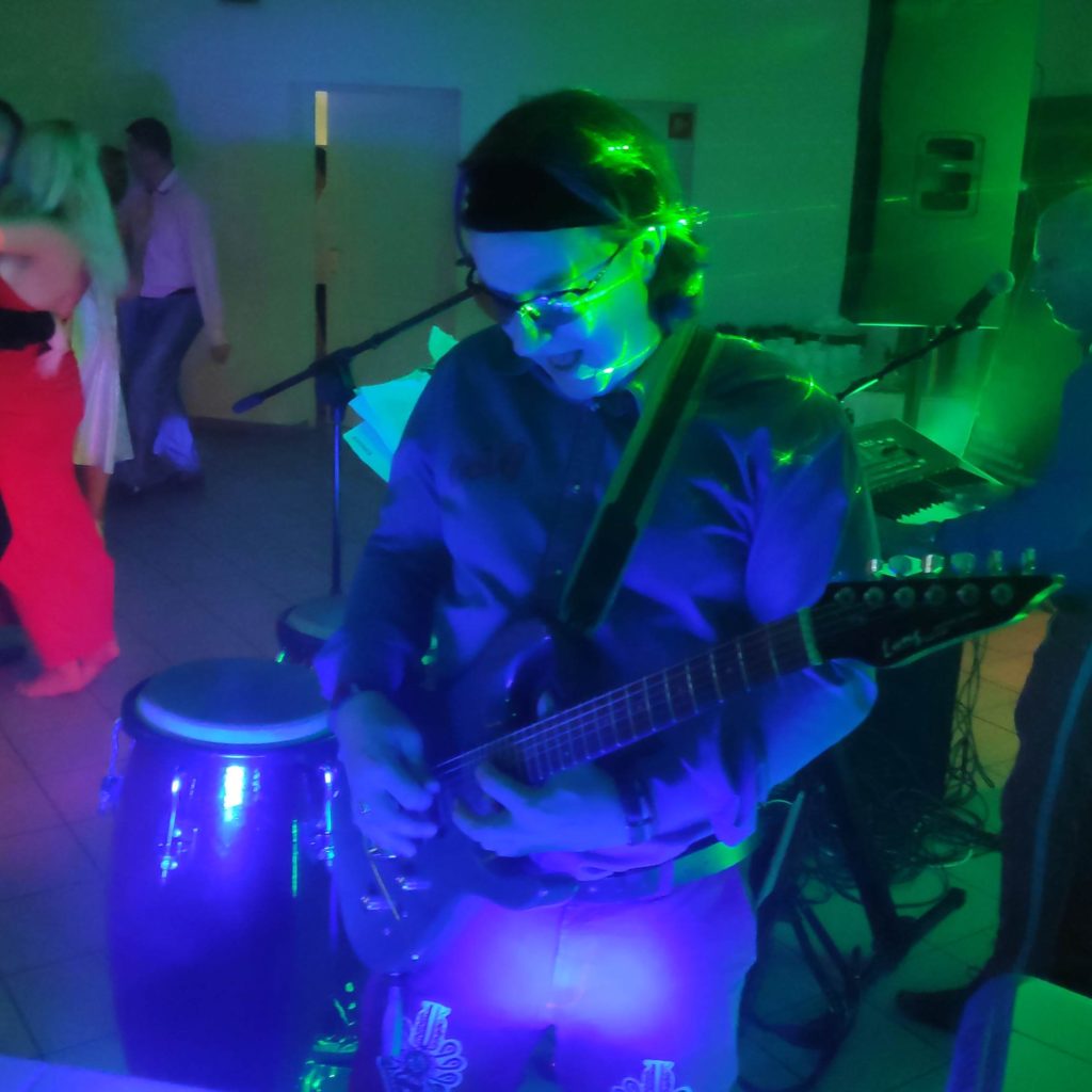
Zapytaj o terminZespół Nova to czteroosobowa grupa zawodowych muzyków pełnych pasji i energii z ogromnym poczuciem humoru.
Dla bardziej wymagających gustów muzycznych na życzenie Pary Młodej skład zespołu poszerzymy o saksofon i skrzypce.
Manager zespołu, doskonały konferansjer! Góral z krwi i kości, dzięki czemu każde wesele jest niezwykle rodzinne.
Lider polskiej i włoskiej piosenki. Wokalista o niezwykle ciepłej barwie głosu, miłośnik cygańskiej nuty. Dba o zaplecze techniczne zespołu oraz najwyższej jakości dźwięk na każdym weselu.
Wokalistka z wyjątkowym głosem. Uczestniczka programu TVN „Droga do gwiazd" oraz ogólnopolskiego konkursu „Festiwal piosenki lat 60 i 70" w Wyszkowie. Ma za sobą liczne występy radiowe i telewizyjne w TVP.
Posiada nietuzinkowe poczucie humoru i rozkręci każdą imprezę. Klawiszowiec i akordeonista… bo jak może zabraknąć akordeonu na weselu!
Jakość dźwięku jest dla nas najważniejsza, dlatego używamy kolumn najwyższej klasy oraz instrumentów klawiszowych, które są liderem na największych światowych estradach. ZAWSZE rozbawimy najbardziej nieśmiałe wesele, a Marcin i Gerard zaopiekują się wymagającymi muzycznie klientami.
jest niezwykle obszerny! Jesteśmy przekonani, że zadowoli nawet najbardziej wyszukane gusta.
Lista piosenek z każdym miesiącem wciąż się powiększa, dlatego trudno nam zamieścić ich stały spis. Gramy największe hity każdego sezonu, szalejemy przede wszystkim przy muzyce tanecznej – począwszy od lat 60-tych, po współczesne disco… także polo :)
Repertuar dobieramy indywidualnie, dbając o szaleństwo na parkiecie.
Na Facebooku znajdziecie nasze najnowsze zdjęcia, filmiki oraz ciekawe newsy. Zapraszamy!
Zobacz na Facebooku